Lyka – Testimonials Concept
A small design challenge for a Testimonials page and to improve the site navigation
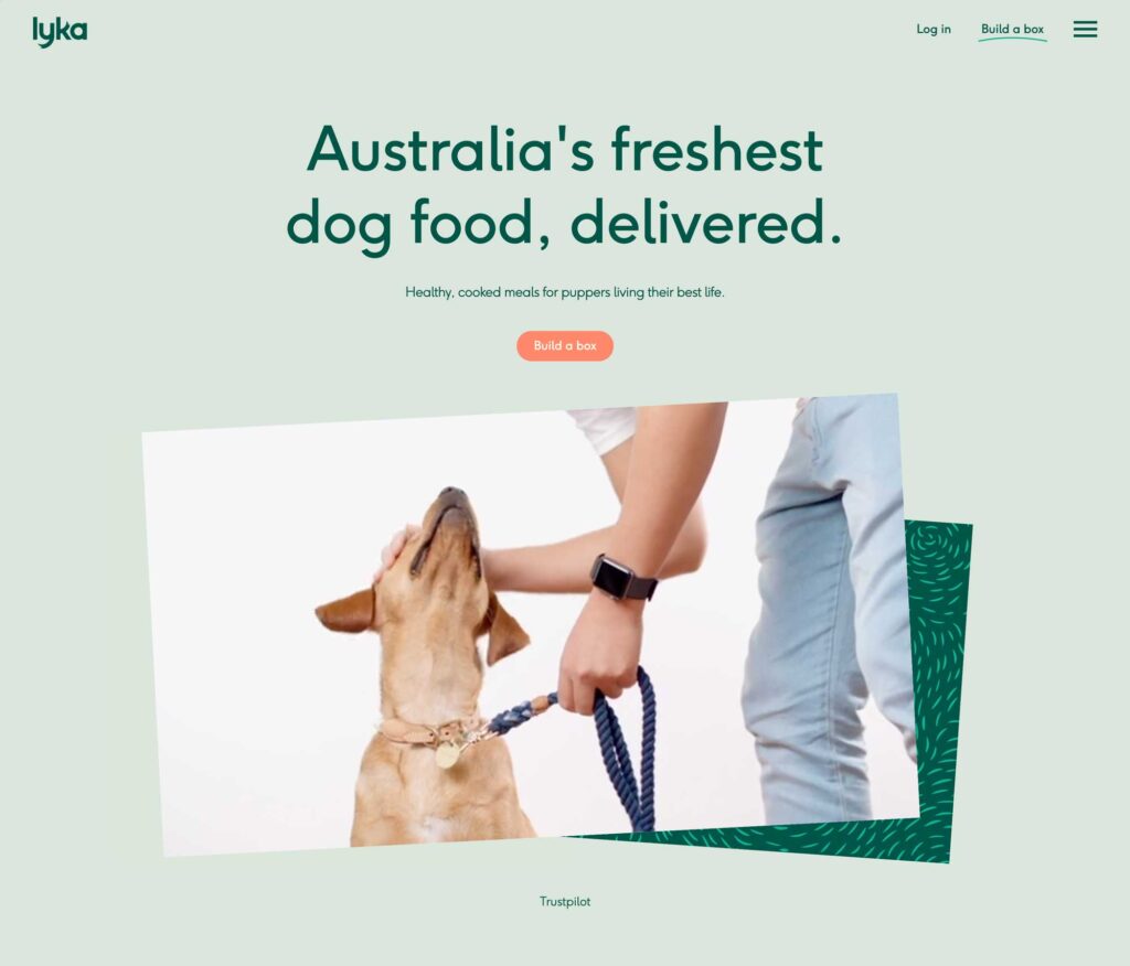
Disclosure: This was the design challenge provided when I interviewed for a position. Whilst I thoroughly enjoyed the exercise I did not pursue the role with the company in the end. However I believe this is a good example to showcase my process and considerations when approaching any design. Enjoy.
Problem
The exercise is to design a Testimonials page for the brand. The brand itself is a startup that provides nutritious, healthy, and fresh food for dogs. The food is slow cooked and makes for a better balanced diet compared to regular dry kibble. A testimonials page is required to drive further conversion on the website by combining:
- Real world reviews from existing customers
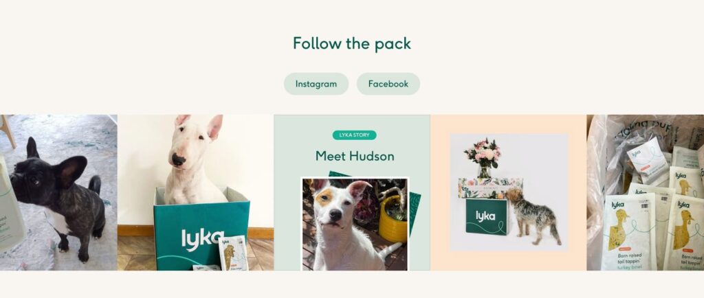
- with Lyka’s existing library of video, blog and social media content
Research
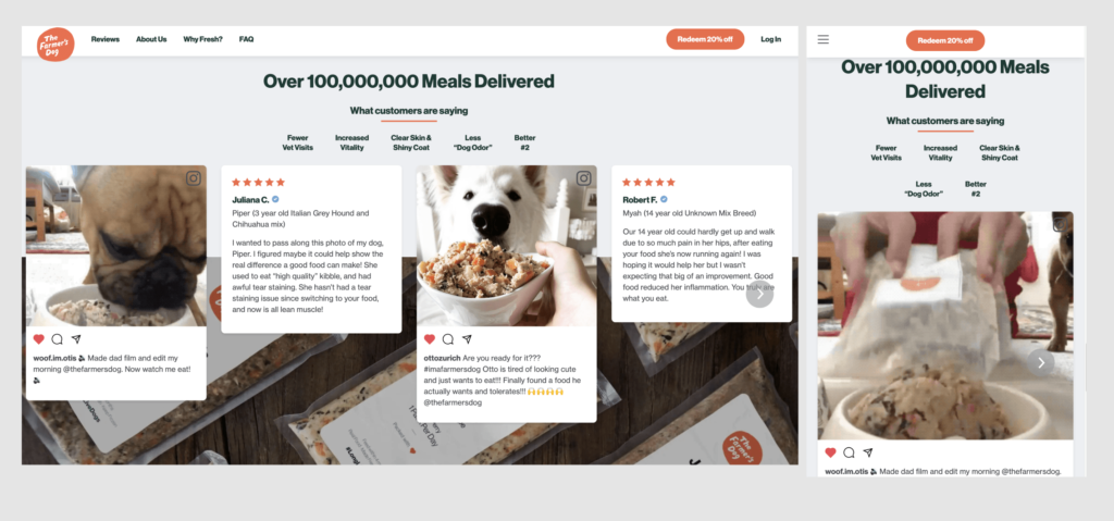
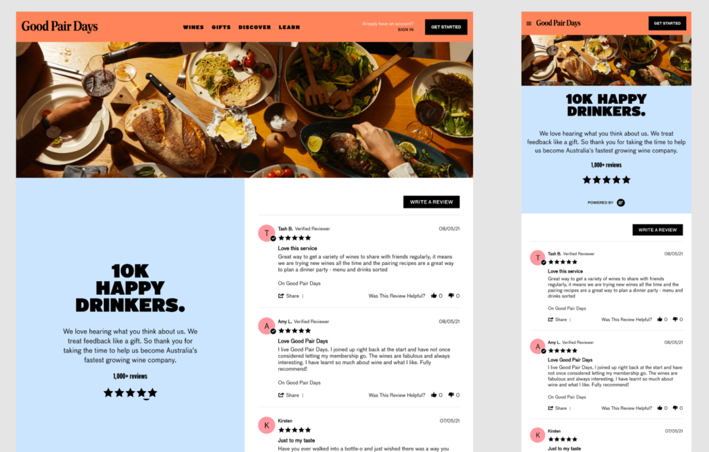
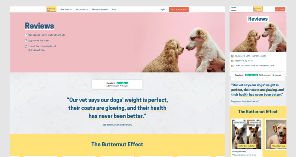
First I researched some competitors and companies that are disrupters in the food and beverage space to see how they are promoting themselves are how they combine reviews, social media, and blog content to their website.
Some of the companies researched:
- The Farmer’s Dog
- Butternut Box
- Good Pair Days
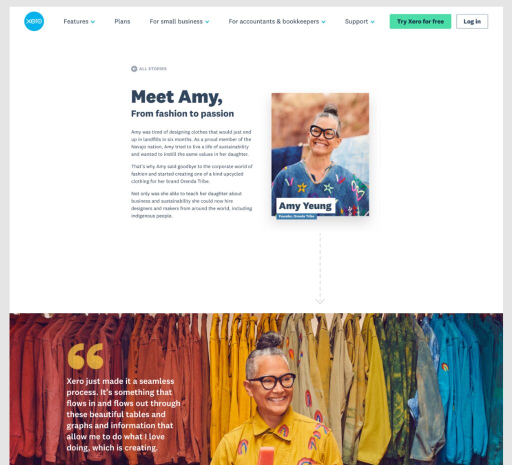
- Xero
- Naked Wines
Here I studied various aspects of their testimonial and social media pages; how they present user generated content, what user generated content do they use, and whether the IA links back to other pages or CTAs in order to drive conversion.
Some websites also showed me what is not suitable for the brand, for example Xero. Compared to competitor websites, which is focused on the nutritional value or overall customer satisfaction, Xero tries to tell an in depth journey of one user from user needs to product acquisition. This approach is not fitting for the Lyka use case since the customer already has some idea of the product they are receiving and its not a complete unknown to them. Hence it was used as a reference of what not to aim for.
Navigation issues
During the research I examined their sign up process / box builder and picked up on some additional navigation issues on desktop.
When trying to complete the wizard to see the amount of food they recommended to my fake dog I found myself constantly trying to find additional information regarding the food satchels, how they are packaged and how they should be served. The use of a hamburger menu with nested linked on desktop made the process of finding this relevant information very frustrating and time consuming so I thought I would take a stab at it during this exercise as well. I made them aware of this during the interview process with them and they seemed to be happy that I gave it a go, hopefully some changes are scheduled in.
Wireframing
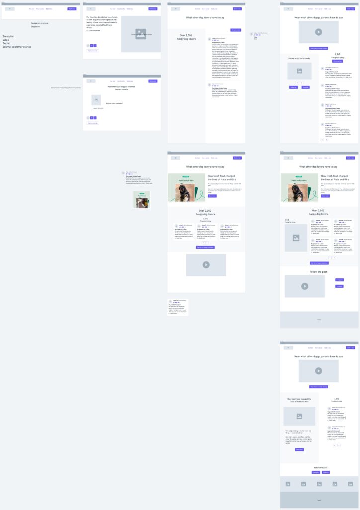
We moved quickly to some basic wireframing due to the nature of the exercise. Noted down some patterns discovered during the competitor research and combined with the information which Lyka wished to include on the Testimonials page, which were:
- Trustpilot score and reviews
- Video content
- Social media content and pages
- Blog content and in depth article links
Mockups
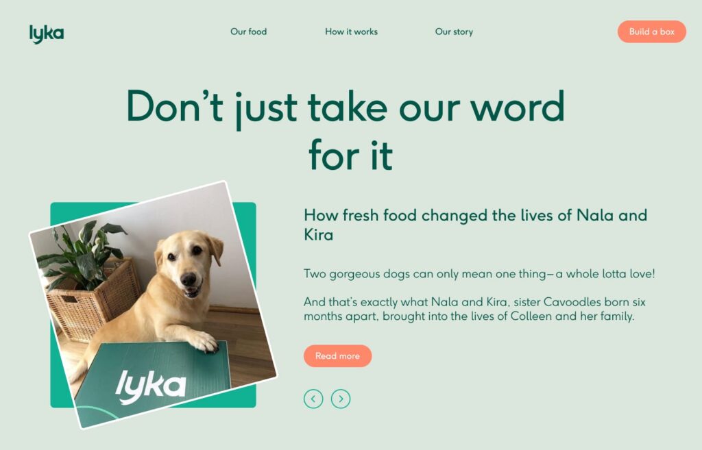
Various panel layouts were created to surface the available content. One challenge was in regards to how users interacted with the existing content, as analytic information was not available I explored various layouts to share back to the stakeholders depending on what the data suggested.
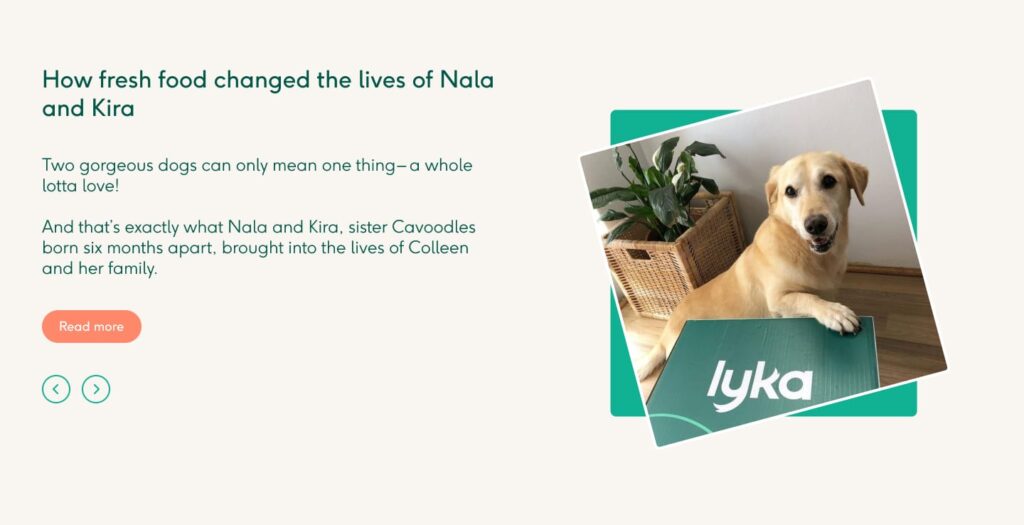
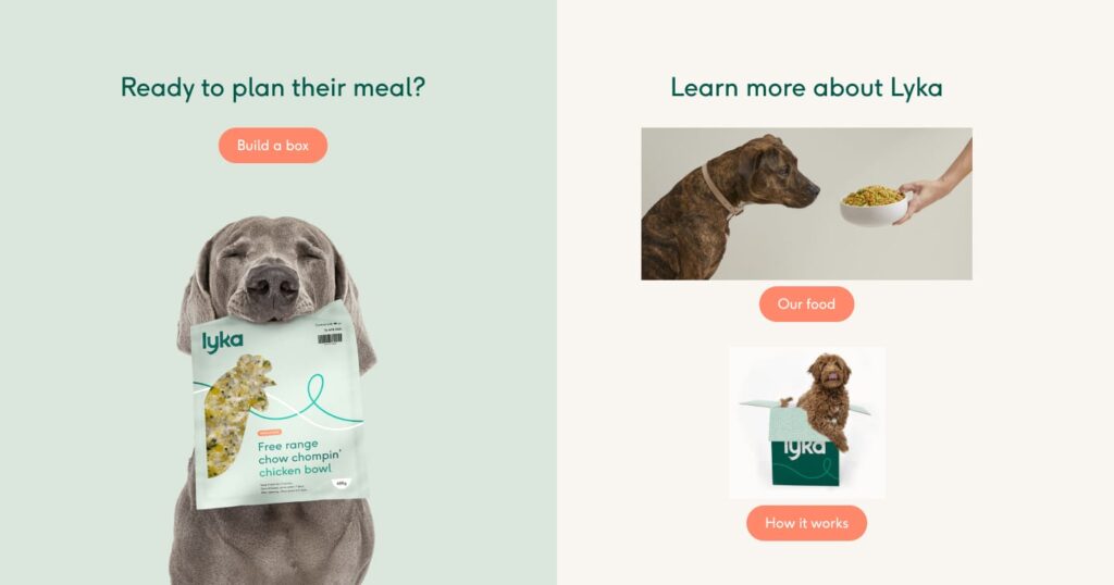
I also explored the 2 column layout (above) which is used on the current website, as a way to deep link into other pieces of content and to keep users engaged and hopefully increase conversion.
Navigation
Before getting to the final output another area I raised to Lyka was the use of the mobile navigation on desktop. This kept some information hidden away, information (for me) was crucial to the purchasing process.
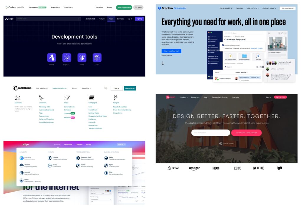
Further research was conducted to see how other websites dealt with a navigation that had to include a Log In button as well as a CTA.
Design
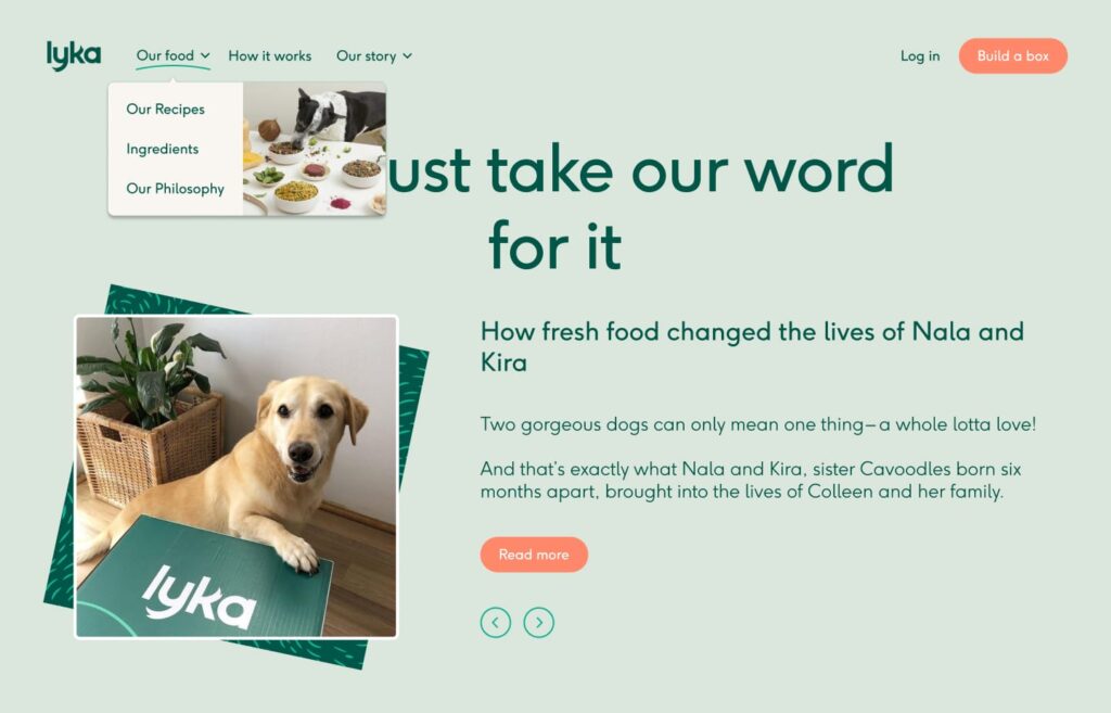
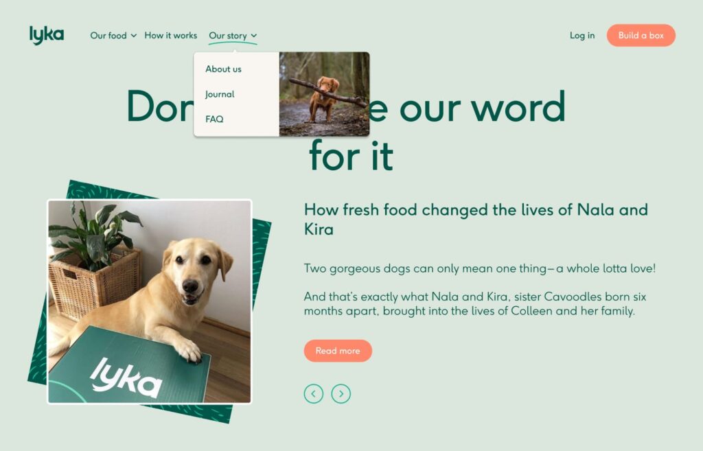
Here is a quick exploration of the navigation. Changes include:
- Moving the section links out of the hamburger menu in order to improve content discovery
- Added a dropdown for child pages such as Recipes, Ingredients, and Philosophy
- Separated the
Log inand theBuild a boxCTA to the right hand side, a clear divide between content and action items
Final Output
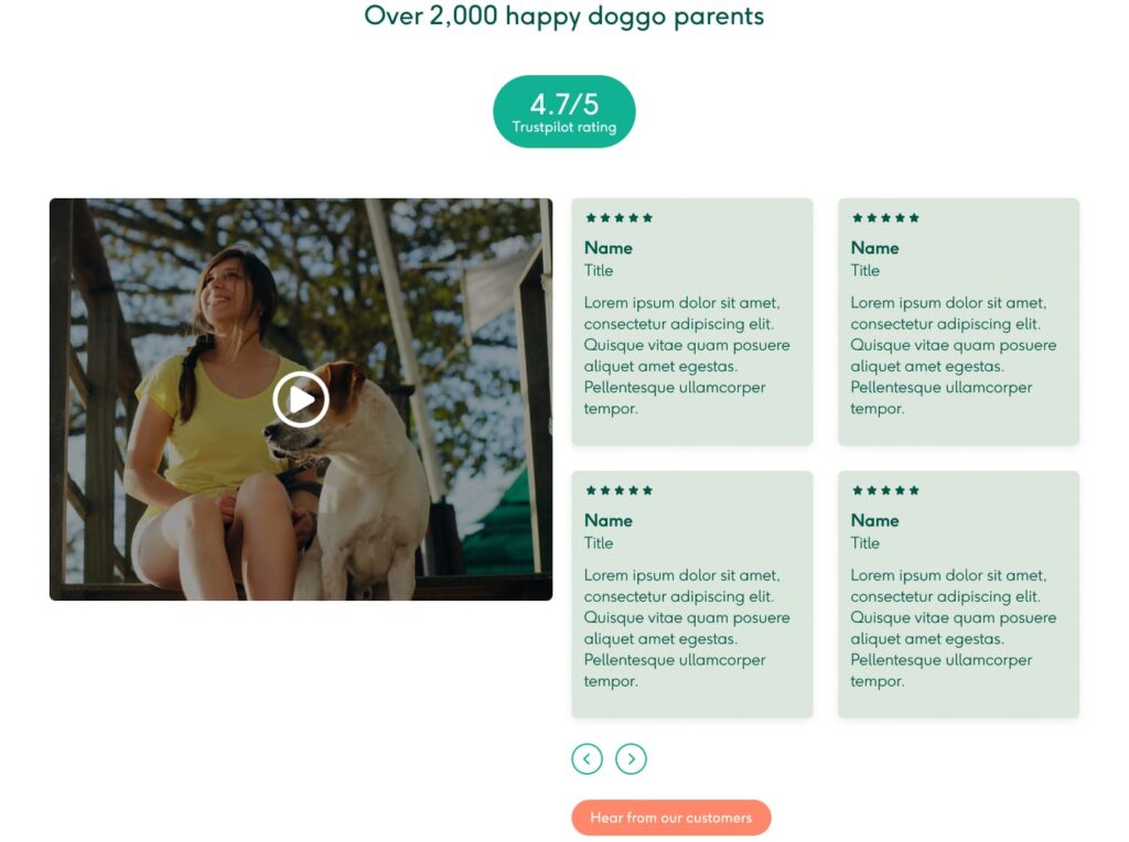
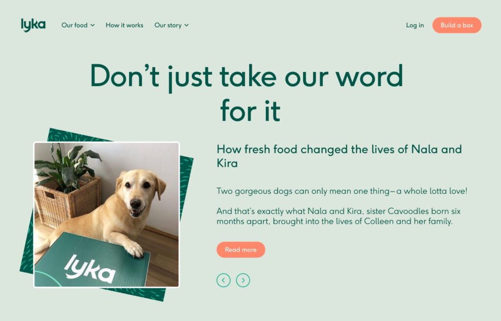
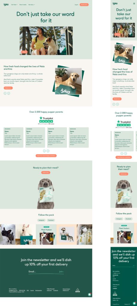
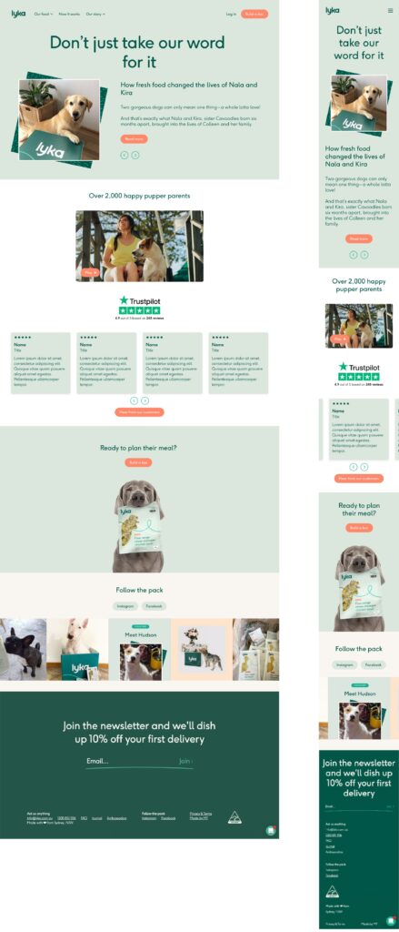
In the end I ended up showcasing two options. The layouts a very similar but I wasn’t able to say which one was objectively better as existing analytics data was not available. One option is if visitors gravitated towards video content, the other is for written content.
They did mention during this share back that interaction with their video content was low. From an external perspective this could be due to the way video is displayed on their current website – videos on the homepage is auto play. However there is a small, non-centered play button for videos on other pages. Another reason may be due to their audience, the majority of them might be visiting from a mobile device hence the low interaction.
Regardless of that, these are two options from a short design exercise.

