Live Asset Mapping
A real time mapping product to locate assets and improve alert response times
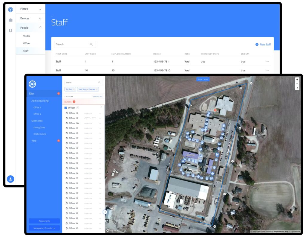
Luckily we know a thing or two about tracking objects in real time at BlueCats so we worked with an alpha client to design and develop a live mapping product which can be deployed across multiple industries in the future.
The client’s main business is in correctional facilities. They provide equipment to the officers and staff who works inside these facilities country-wide, but saw the opportunity to improve safety and response times by leveraging BlueCats’ expertise in the real time location space.
Roles
- UX Research (Client interviews, remote video observations)
- UI design (Sketch & Figma)
- Usability testing (Internal & 3rd party user tests)
- Developer handoff (HTML/CSS)
Problems & Opportunities
Correctional facilities can be a dangerous place, problems can arise in an instant and guards/officers are generally outnumbered by the inmates in most parts of the facility.
Up until now most facilities relied on standard radio communication or emergency buttons located inside rooms and hallways to alert staff and call for assistance. By combining the client’s technology with our own, we were able to offer their customers a unique mapping solution that can tell the staff/operator exactly when and where an alert is being triggered – all done with a press of a button for both officers and visitors of the facility.
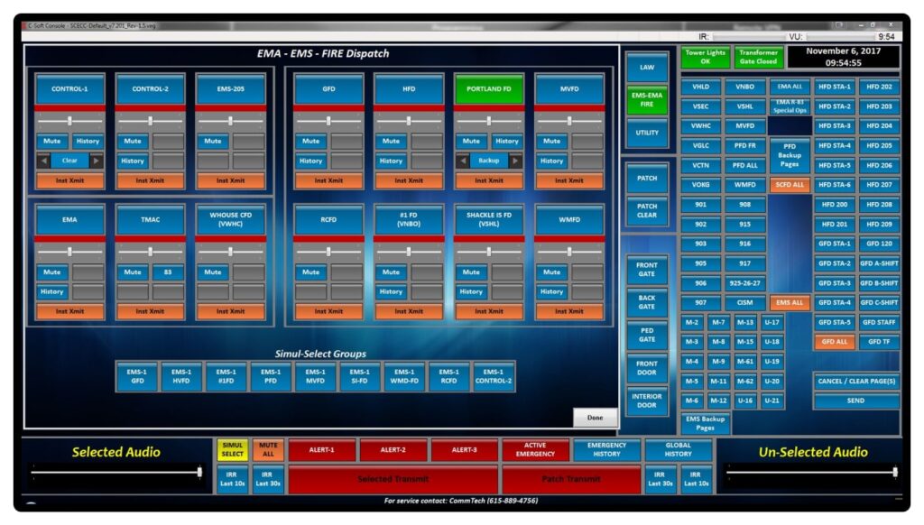
After an initial brief was drawn up between the client and the product manager we looked into and took inspiration from mapping tools across the web as well as tools that emergency dispatchers use – as the client indicated that our users will either come from that background or their current systems closely resembles those workflows. However this also brought new and unforeseen challenges – namely the quite complex applications that were action-based, not the scan-and-select interaction that our product is meant to provide.
Context & Needs
In order to develop a tool that was more than simply mapping we had to understand
the user problems and goals, here are issues face by both an operator and officer/staff/
visitor perspective, that our tool attempts to solve:
- Operator of the system
- Where is officer 1?
- How long have they been in this area? Are they falling behind their patrol schedule?
- Officer 1 has not checked in, I need to locate them onsite
- Is this particular officer still onsite or has his shift finished
- I need to know how many officers are inside this area – is the area understaffed?
- Are visitors in an area without officer supervision?
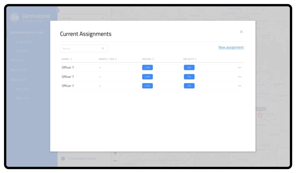
- I need to assign/replace a device for an officer/visitor
- Does this device need to be replaced?
- Officers/staff/visitor
- I am having a problem and need assistance
From this we then mapped out to various task flows:
Wireframes & Prototypes
The workflows were then translated into various wireframes.
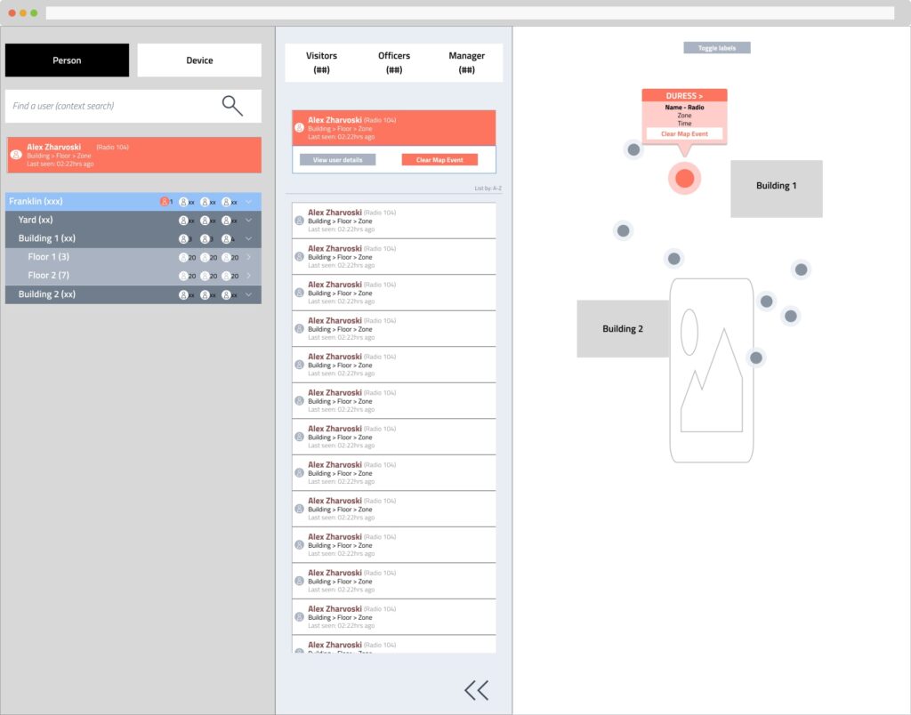
One of the important UX problems we came across here was how the alert system would work if the officer triggering the alert is not in the current map displayed on screen, whilst keeping the workflow of addressing alerts consistent. We did not want the operator to waste time trying to figure out where the alert came from or resort to the search box in this situation.
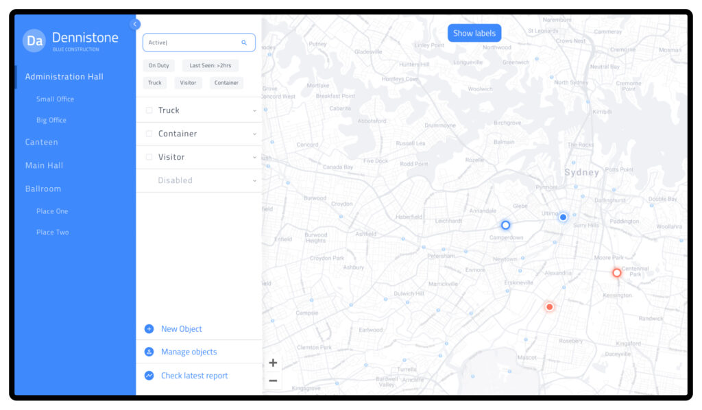
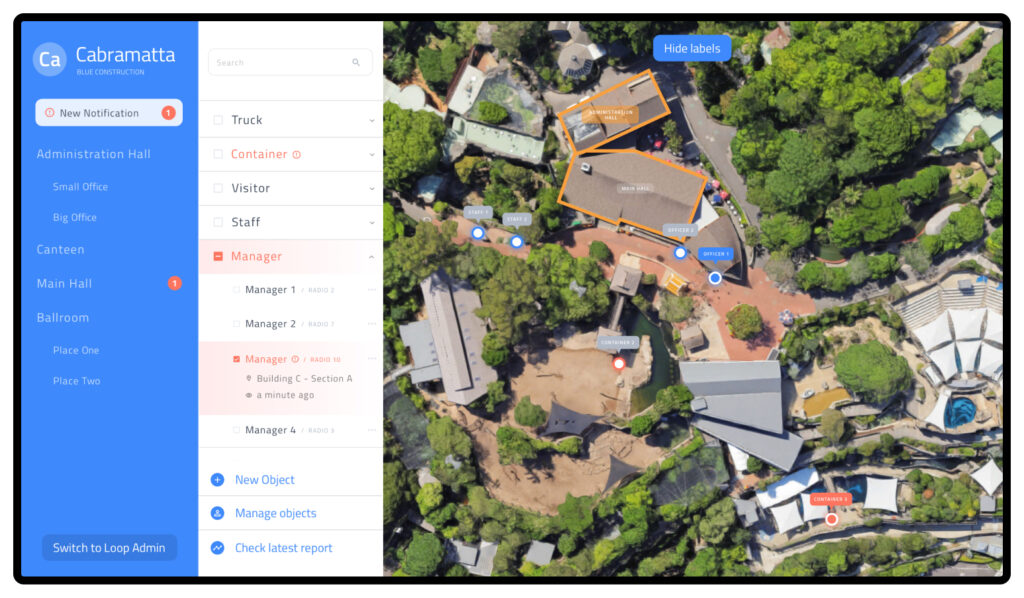
The solution we came up with was pretty straight forward as the UI was split into 3 panels; Location, People, and Map:
- When an alert is triggered – a special alert card will be shown on the Location Panel as it is the one panel that is consistent during navigation.
- If the alert is in the current view – another alert card will be shown on the People Panel displaying the officer’s details. Operators can address the issue on the spot.
- If the alert is not in the current view – the operator can navigate to the officer directly by clicking the alert card on the Location Panel. The new area loads, and with it the officer details on the People panel will also be displayed
By implementing this workflow we were able to transport the operator to the scene of the issue with one click.
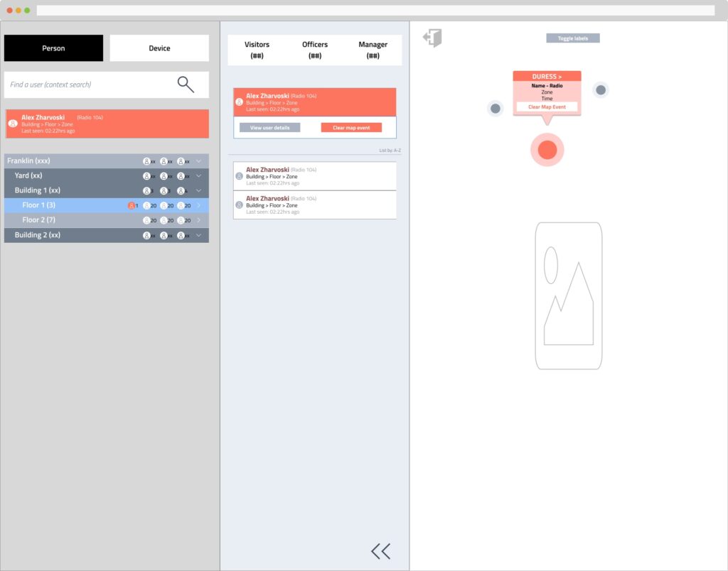
After presentations to the client and both internal usability testing as well as client managed external user testing we moved into higher fidelity mockups and converting it to HTML/CSS dummies for development.
Results & Ongoing improvements
We have since deployed the system into multiple client facilities and are continuously receiving feedback on the Live Mapping UI. The impacts have been extremely positive from the software side, with minimal operator training required and a definite improvement in their response time.
One has to bear in mind that the UI was not created specifically to solve the problems of this one client – it is part of a complete solution BlueCats provide. As we deploy this UI to clients in other industries we, the product team, are continually working to improve the overall system, implementing features that would benefit a wide range of customers.


